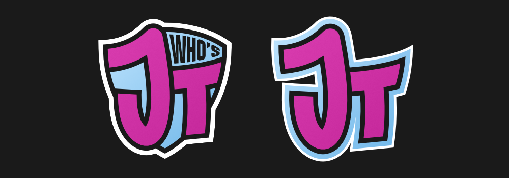
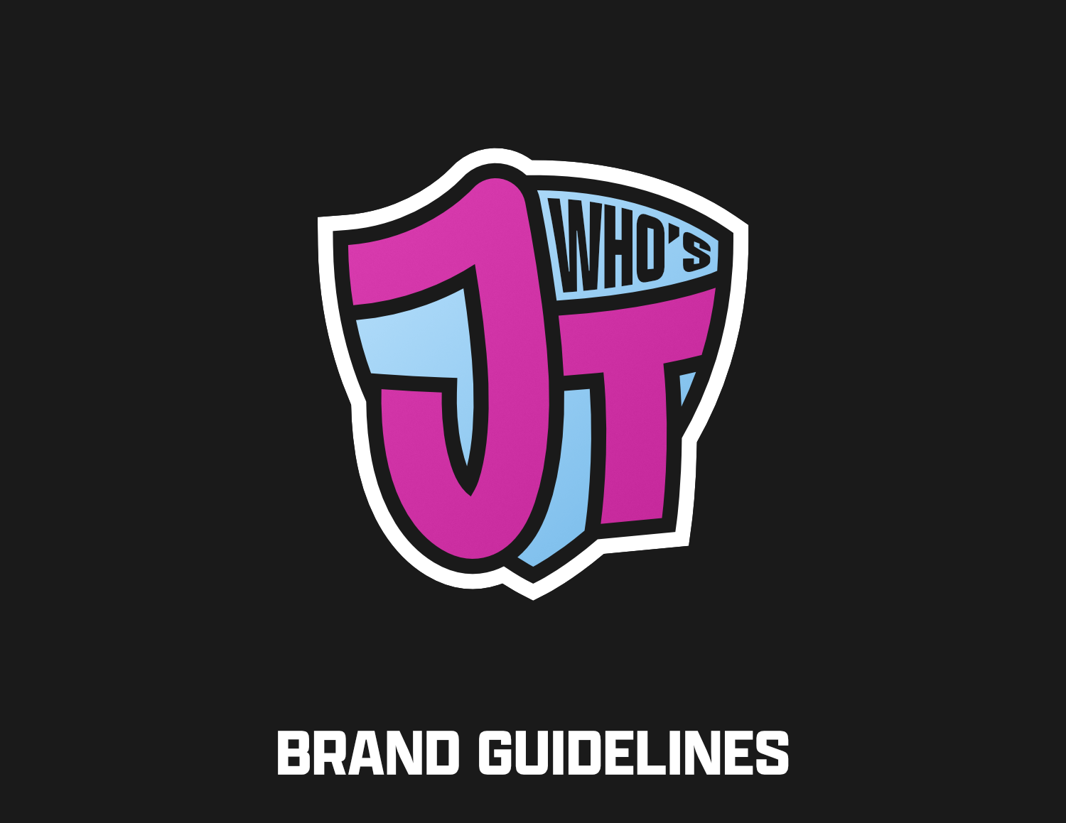
WHO'S JT
- Brand Identity

When a high school friend of mine reached out to me asking to help him create a logo for his streaming brand, it sounded like a very fun opportunity, and I accepted. Despite enjoying playing video games and watching content surrounding them, I had yet to do any design work in the streaming or e-sports spaces.
Pre-Project Briefing
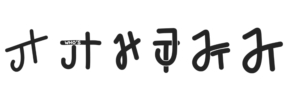
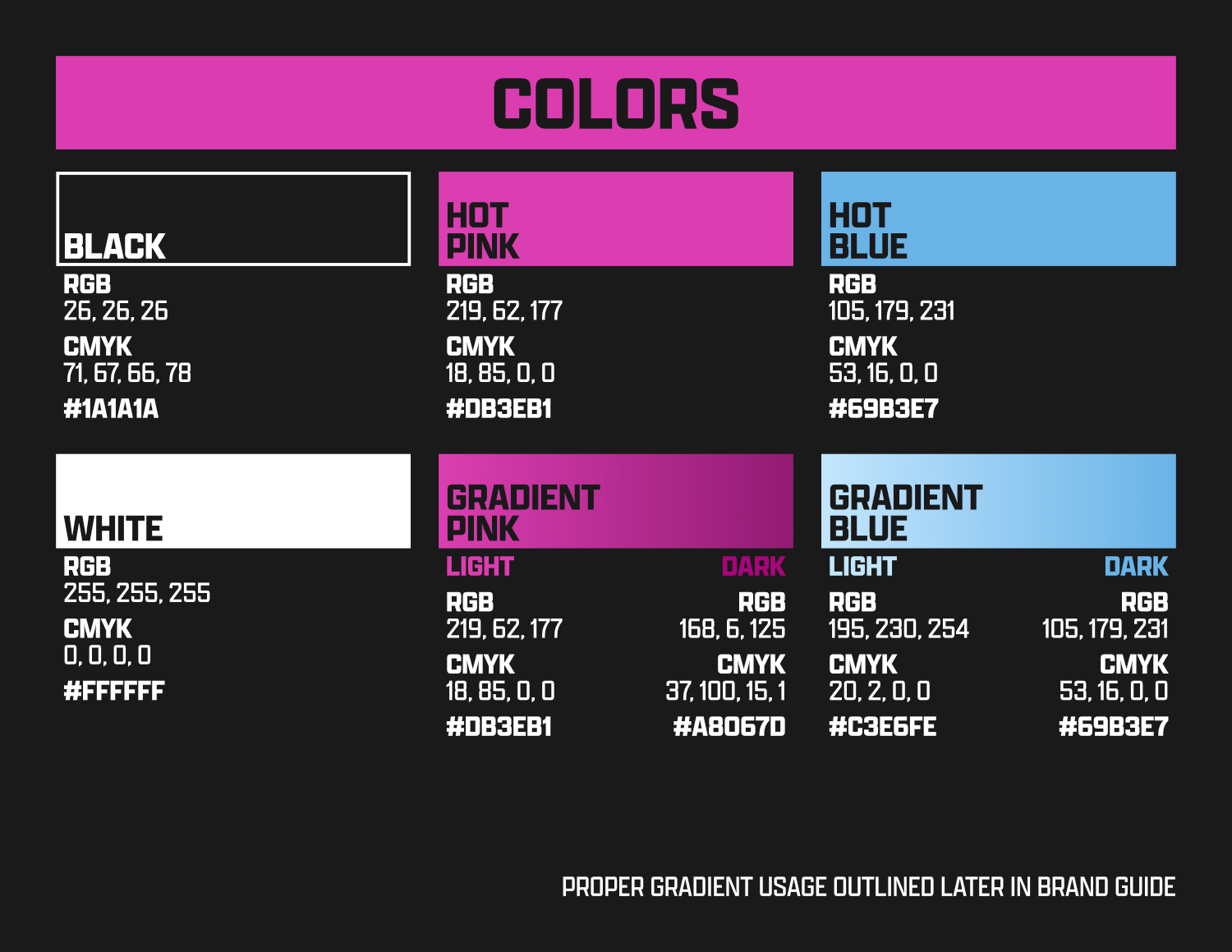
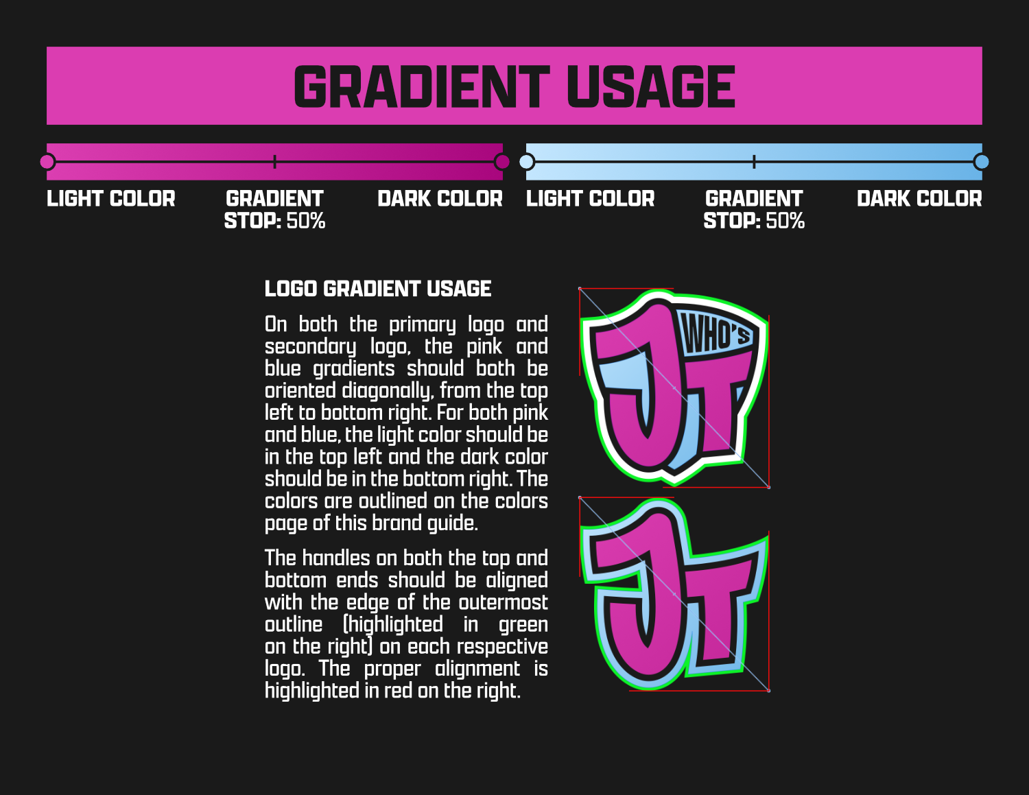
The main idea JT had in mind for his logo was the general look and color scheme - a Miami Vice style look. Hot pink, bright blue, black, and white would comprise the color scheme, while Hotline Miami and “the 90s text meme” as visual references for the look he was hoping for.
Logo Process
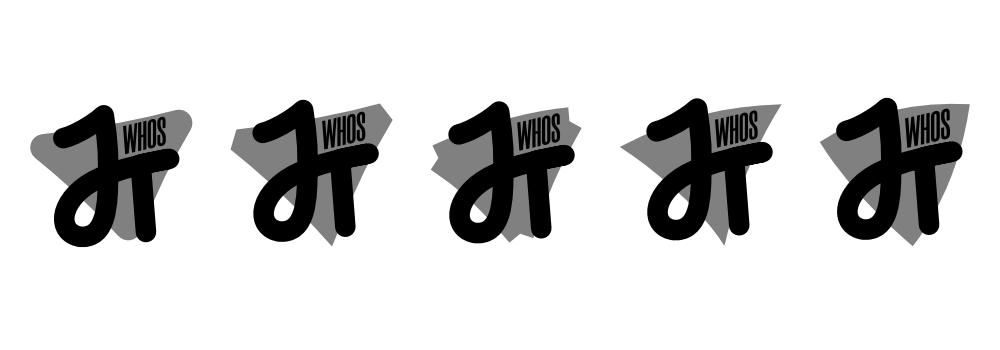
After presenting JT with a round of sketches, we decided on which of the ideas to move forward with. A triangular shape was added into the background afterwards.

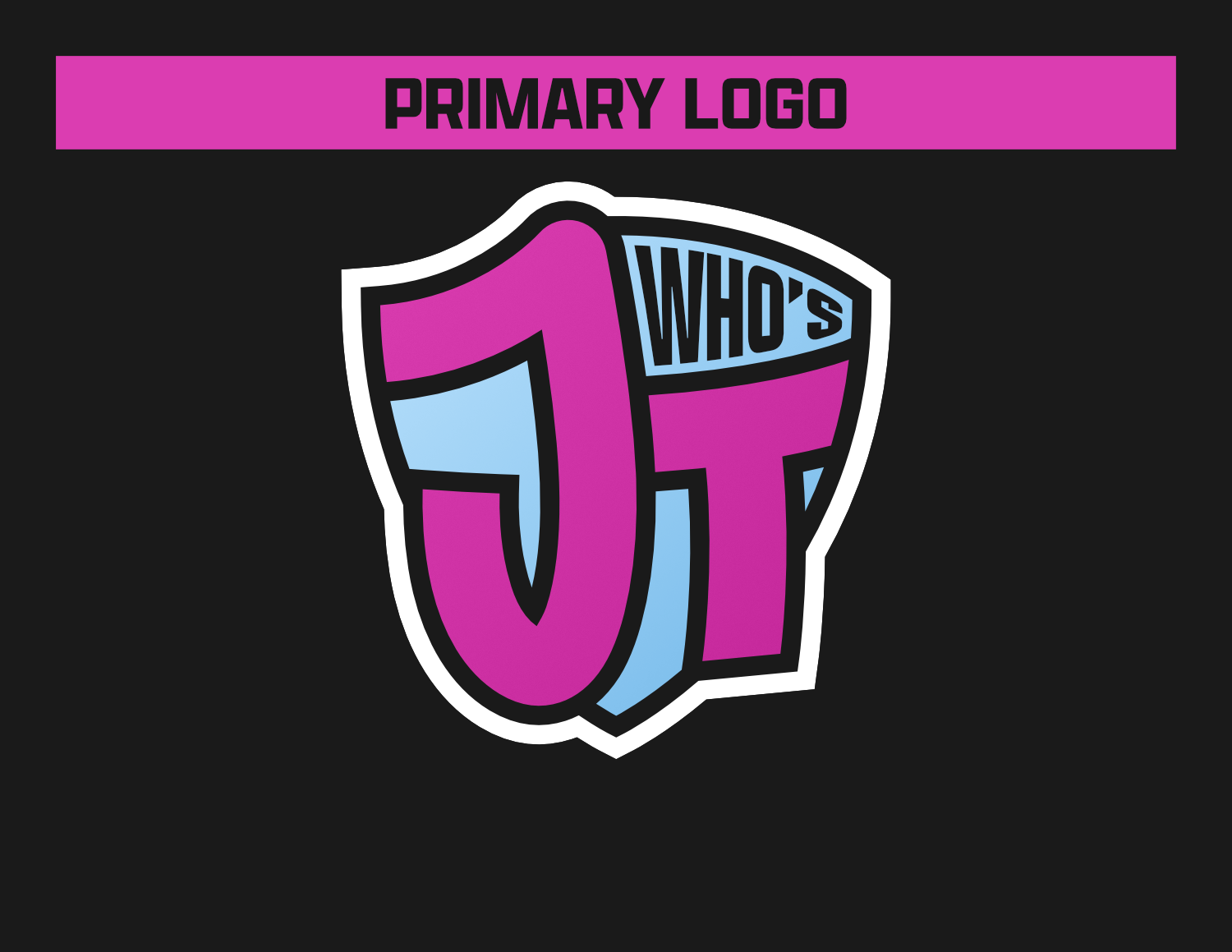
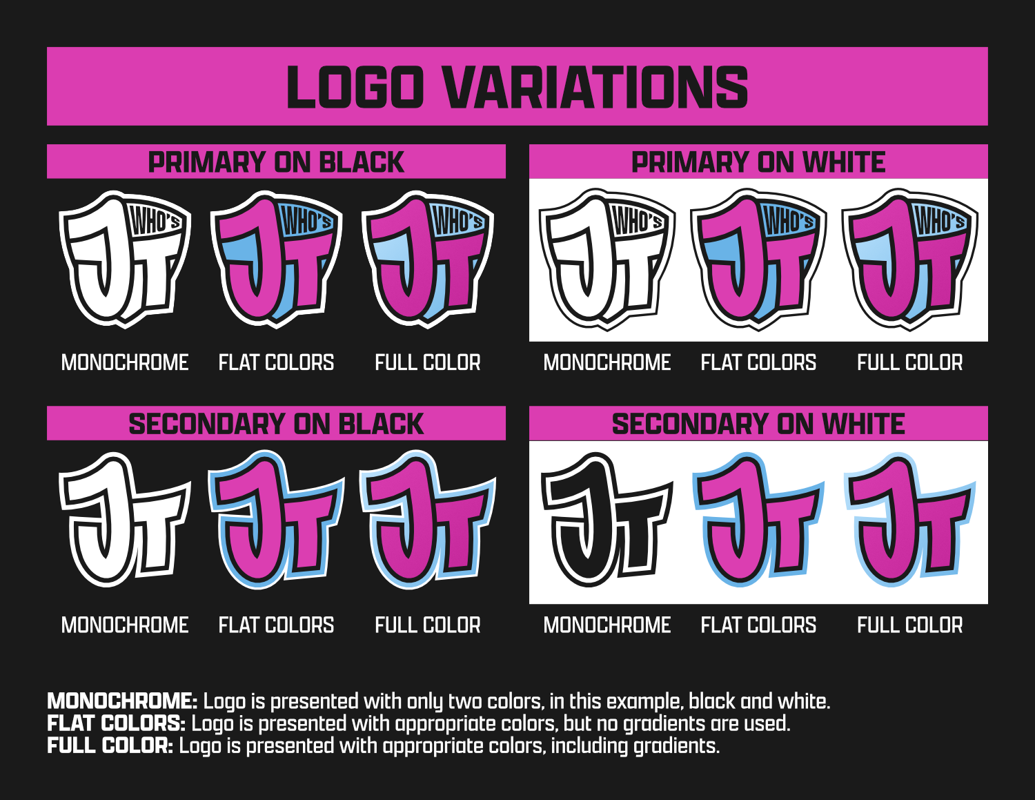
After the initial vectorizing of the logo, we experimented with variations for the background shape, and ultimately to use a convex 3 point shield.
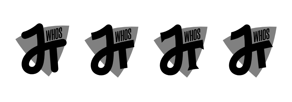
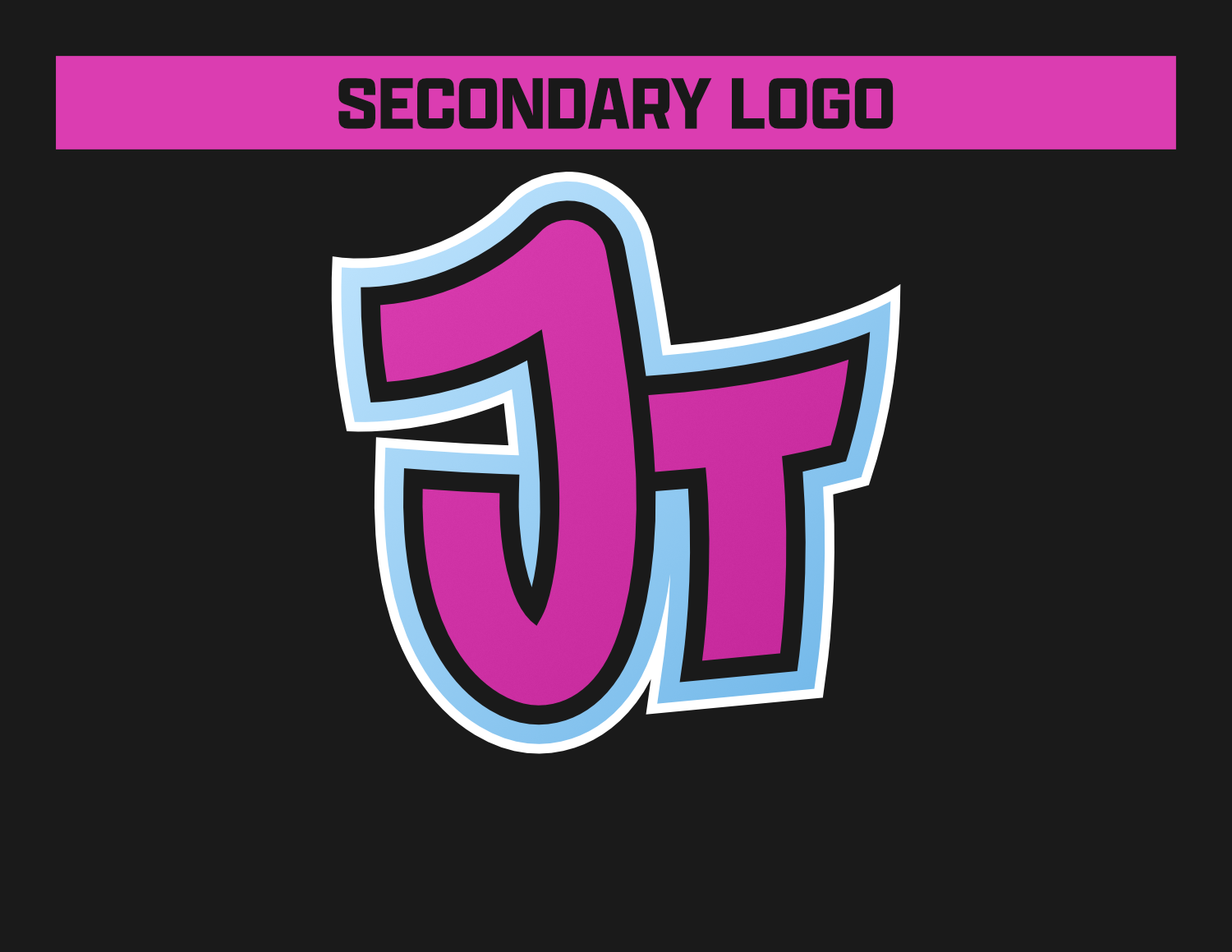
The last major step was figuring out the style of the JT monogram, in which the flat ends were chosen.
After applying the desired color palette to the look and making a few final adjustments, it had been brought to my attention through third-party critiques that the “J” shape we had been using did not read well as a “J”. That prompted a change from a looped version of the J connecting to the crossbar of the T, into a more traditional J shape, and leaving the T as a separate entity.
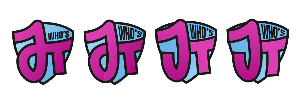
The final result is one that both myself and my client are happy with.
Brand Guidelines
- Date:Mid-Late 2022