PITTSBURGH PHOENIX
- Fantasy Hockey Identity
In the spring of 2021, I designed the Pittsburgh Phoenix brand as my senior project in university. It was designed as a fictional team that played in the NWHL in the 1980s. The page for that project with more details can be found at this link.
Myself and a group of friends participate in a fantasy hockey league called the JNHL - Jersey Nerds Hockey League. Each member is a designer, and while we may have differening levels of design experience and skill, we share a love for sports uniforms, and designing them ourselves. Thus, each member of the league designs their own team from the ground up, choosing a city for their team to play in, a team moniker, and of course creating the team's logos and uniforms. And I liked my Pittsburgh Phoenix brand so much, that I chose to "modernize" it for use in the JNHL.
COLOR SCHEME
Being a sports team playing in Pittsburgh, the obvious choice is to stick with the iconic black and gold. And for the team's inaugural 2021-22 JNHL season, the color palette was strictly such - black, gold, and white. But, entering the 2022-23 campaign, I felt the identity needed to be spiced up a bit this season. I chose to add three shades of orange to the black, gold, and white, giving a much more fiery palette to the team based on a flaming bird.
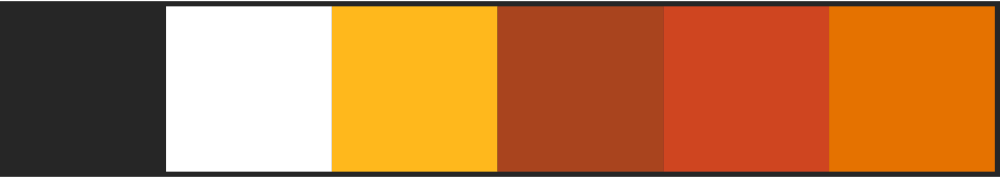
Only the darkest shade of orange is used in team logos, while the other two shades are only used in the uniforms (shown later).
PRIMARY LOGO

Originally the Phoenix’s secondary logo in their first JNHL season, the primary logo features the head of the Phoenix peeking out of a triangle. If you notice a resemblance to the Pittsburgh Penguins' "robo penguin" logo, you would be correct. Seeing as this is merely a fantasy hockey team, I chose to pay homage to the team that I grew up cheering for that plays in the same city. Even without the homage, the golden triangle is of course still relevant Pittsburgh symbolism.
SECONDARY LOGO

Originally the primary logo, this is simply a modernized version of the 1980s Phoenix logo from the original senior project.
JERSEYS
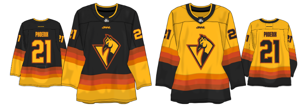
As previously stated, I felt like the Phoenix needed a visual shakeup for their final season, so I also decided to go a bit out of the box with their uniforms. While it isn't anything too crazy, the three shades of orange create a faux gradient out of the stripes on the jersey, creating a fittingly fiery look for the team.
- Date:Mid 2022